Anchor your empty wall with 3–4 foot artwork positioned above seating, then layer woven textiles in varied densities for depth.
Install modular open shelving at 12-inch depth, positioning pieces off-center to build visual rhythm.
Add gallery walls using magnetic frames for flexibility.
Strategic lighting—wall sconces or long-arm fixtures—illuminates art and reduces flatness.
Frame zones with picture molding paired to complementary wallpaper.
Ground everything with a credenza beneath artwork and a sculptural accent chair.
These layered approaches create focal points that define your room’s aesthetic.
Fill Your Wall With Large-Scale Art
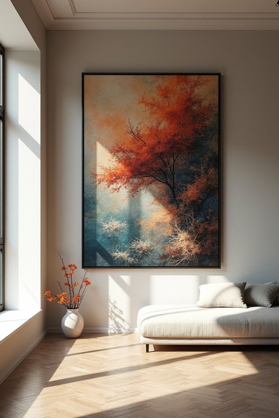
How do you fill a vast expanse of empty wall without creating visual discord? Large-scale art serves as your solution. I recommend positioning a single 3–4 foot tall piece or paired oversized prints directly above your furniture. This approach anchors the wall and establishes visual balance.
Large-scale art anchors empty walls and establishes visual balance when positioned strategically above furniture.
Consider a gallery wall combining 2–3 substantial pieces with varied frame sizes. This method creates rhythm without crowding. Stack artwork vertically on your console or sideboard to extend upward presence and draw attention higher.
Strategic lighting amplifies impact. Wall sconces or long-arm fixtures illuminate your pieces and eliminate flatness. This layered approach improves the space.
Budget-conscious options exist. Large-format prints from emerging artists, thrift-store discoveries, or DIY oversized canvases fill wall space affordably. You’ll achieve professional results without financial strain or proportional imbalance.
Layer Woven Textiles and Tapestries for Instant Depth
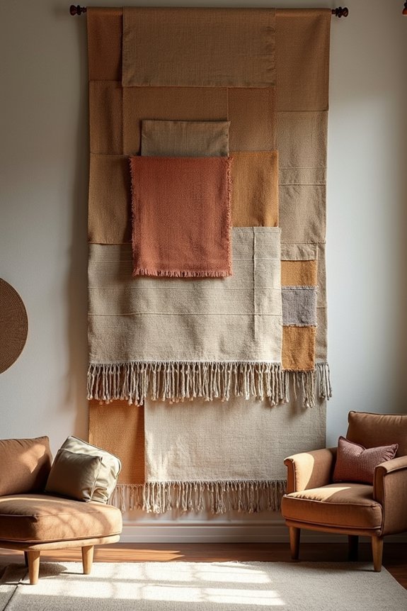
I’ll layer woven textiles strategically to build visual depth through texture variation, material contrast, and intentional spacing. You can combine natural fibers—jute, wool, linen—with differing weave densities to create dimensional interest that shifts across viewing distances. Coordinating color palettes while maintaining scale balance between a dominant centerpiece and smaller supporting pieces prevents visual chaos and establishes a cohesive arrangement.
Texture and Visual Interest
When you’re ready to move beyond flat paint, layered woven textiles and tapestries deliver immediate depth and tactile dimension to your living room wall. I arrange pieces in varying scales—a substantial center textile anchored by smaller accents—to build visual interest without overwhelming the space. This approach makes texture a primary design consideration rather than an afterthought. I alternate between woven fabrics, braided pieces, and tapestries to establish richness through material contrast. Each texture catches light differently, creating dimension that flat surfaces can’t achieve. I select textiles in tones matching existing furniture and rugs, maintaining visual consistency while enriching the wall’s appearance. The result is a gallery-like arrangement where texture becomes the unifying design element connecting all room components together.
Layering Multiple Woven Pieces
Layering multiple woven pieces creates visual interest on a blank wall through strategic arrangement and material contrast. Vary the weave density, color palette, and scale across each textile to establish rhythm and avoid uniformity. Position woven textiles at staggered heights to build depth while referencing gallery-style displays. Overlapping arrangements allow pieces to extend beyond one another, enhancing the layered appearance.
Balance visual weight by pairing heavier woven textiles with lighter elements. A slim console table or mirror beneath the arrangement prevents the wall from feeling overcrowded. Using removable rods or lightweight textiles enables seasonal updates without structural modifications. This approach builds depth and texture while maintaining flexibility for future adjustments and individual expression within your space.
Color Coordination and Balance
How do you select colors that work well with your existing décor? I recommend choosing textiles in a cohesive color family that echoes your furniture and current textiles. This wall color coordination approach maintains visual unity throughout your space.
| Existing Wall Color | Textile Palette | Visual Result |
|---|---|---|
| Neutral (beige/gray) | Warm earth tones | Enhanced depth, unified appearance |
| White/cream | Jewel tones or pastels | Defined focal point, balanced contrast |
| Bold color | Complementary neutrals | Grounded composition, reduced visual competition |
Layer broad woven pieces with smaller accents at varying heights. This scale mixing creates interest without overwhelming the space. Select lightweight textiles with removable mounting options. You’ll preserve sightlines while maintaining flexibility for seasonal updates or palette adjustments. Position your arrangement with a slim console or wall-mounted shelves beneath larger tapestries. This positioning establishes visual balance and functional integration within your living room design.
Hang a Gallery Wall: Flexible Frames for Easy Updates
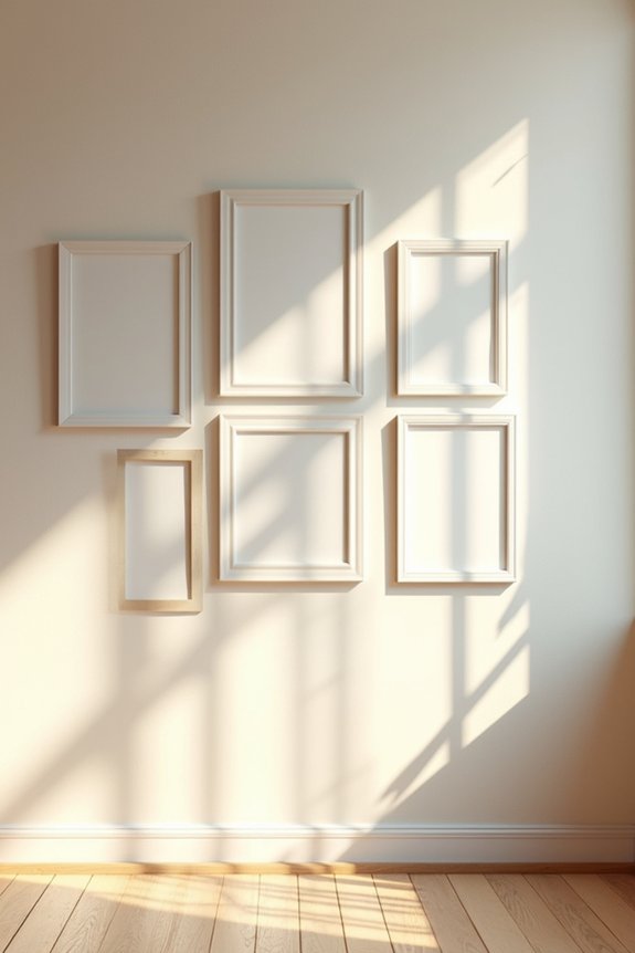
A gallery wall arranges mixed-frame sizes across your empty wall, creating visual interest while maintaining flexibility for future updates. Cluster three focal pieces as anchors, then supplement with smaller prints to establish balance across large wall surfaces. Consider magnetic or hinged frames designed for quick art swapping. These mechanisms simplify rotating artwork without wall damage or reinstallation hassle.
Position artwork at eye level, testing sightlines from your primary seating areas to verify balanced composition. Art rails offer an adaptable mounting solution accommodating different sightlines and room configurations. This installation method lets you adjust spacing and height as your collection evolves. By selecting frames with quick-swap functionality and planning layout strategically, you’ll create a gallery wall that grows with your aesthetic preferences without requiring extensive renovation.
Install Open Shelving for Storage and Display
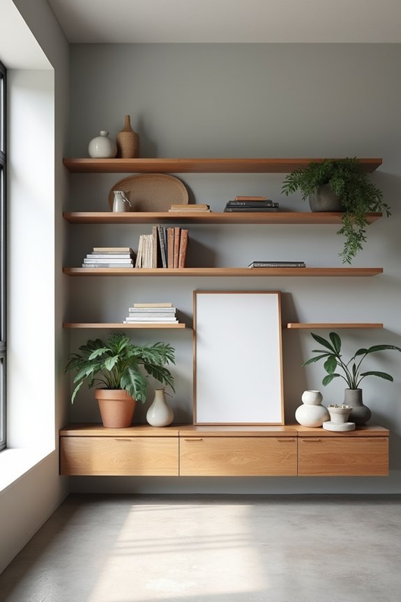
I’ll install modular shelving systems like Room & Board’s 80-unit design, which offers adjustable heights and 12-inch depth for efficient storage without compromising room flow. You can balance function and aesthetics by strategically placing books, plants, and sculptures across shelves while maintaining visual breathing room through deliberate spacing. This approach gives you flexibility to update your display as your style evolves while achieving a polished, built-in appearance at a reasonable cost.
Modular Systems For Flexibility
Where does flexible storage meet intentional display in a pass-through living room? Modular systems deliver the answer. Room & Board’s adjustable shelving units span 80 inches with 12-inch depth, maintaining sight lines between rooms without bulk. You’ll position shelves at varying heights to accommodate books, plants, and a potential bar setup. The slim-profile design prevents the space from feeling cramped or divided. Adjustable mechanisms let you reconfigure shelves as your needs shift—a key advantage over fixed installations. Pair your modular system with magnetic frames for easy art rotation and quick updates. Position the unit off-center from wall art to create visual rhythm. This approach combines practical storage with curated display, anchored by hardwired sconces or plug-in lighting that highlights your arrangement.
Styling With Books And Plants
How do you arrange shelving into a thoughtful display that serves both storage and visual interest? I organize books by size and color, establishing visual rhythm across the wall. Varying plant heights soften the shelving’s linearity while adding organic texture. This adaptable display approach lets me swap items seasonally without permanent commitment.
My shelving system uses 80-unit length with 12-inch depth, keeping the footprint slim yet accessible. I position sculptural objects and woven baskets on lower shelves, preventing visual monotony. Books and plants work together—heavier volumes ground the arrangement while trailing greenery adds dimension.
The key to effective wall styling involves negative space above the top shelf and a centered art piece. This balanced composition creates a unified visual anchor for the entire room while maintaining functional storage.
Balancing Function And Aesthetics
Open shelving uses an empty wall for functional storage while keeping the visual cohesion you’ve established through thoughtful styling. I recommend a Room & Board modular system featuring approximately 80 units, each 12 inches deep. This design balance prevents overwhelming your space while accommodating books, plants, and decorative objects.
Position a slim-profile console or armoire beneath the shelves to ground your vignette. Layer vertical wall art above to create a unified focal point. Off-center shelving or peg rail systems reference mid-century aesthetics while offering flexible storage options.
Integrate lighting strategically—a long-arm wall sconce or centered vertical fixture highlights selected shelves and artwork. This approach improves depth perception and visual interest throughout your room.
Test your layout with temporary mockups before installation. Verify sightlines from seating areas remain comfortable and unobstructed.
Add Architectural Details: Molding and Wallpaper
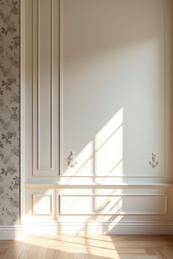
When you’re facing a blank wall that demands visual interest, architectural details like molding and wallpaper offer a practical solution. I recommend combining picture-frame molding with complementary wall coverings to define zones without major renovation. Install molding in geometric patterns across your wall’s surface. This creates depth and establishes clear visual boundaries.
Pair your molding framework with textured wallpaper or solid finishes inside the frames. The layered approach adds dimension while maintaining budget consciousness. Select molding proportions that match your wall’s scale and existing furniture placement. Oversized details overwhelm small rooms; delicate profiles suit tight spaces.
This strategy turns blank walls into architectural focal points. You’ll achieve a framed, intentional look that signals design confidence to anyone entering your space.
Use Lighting to Define and Warm the Space
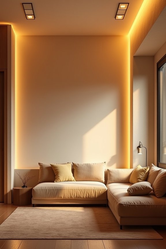
Architectural details establish visual structure on your wall, but lighting determines how viewers experience that framework. I recommend positioning wall sconces or longer-arm fixtures to highlight focal points like framed prints above a credenza, creating balanced emphasis through centered light placement. Hardwired sconces offer clean aesthetics; plug-in options work when wiring isn’t feasible. Pair lighting with reflective surfaces—mirrors or glossy finishes—to bounce light throughout the room, visually expanding your space. Dimmable or adjustable fixtures give you control over ambiance for different activities, shifting from daily living to entertaining guests. This layered lighting approach makes your wall an architectural backdrop and functional design element that defines zones and establishes warmth throughout your room.
Arrange a Styled Moment With Furniture and Decor
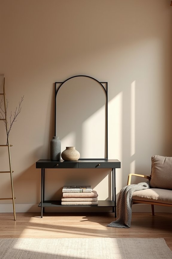
A styled vignette anchors your empty wall by layering furniture, artwork, and accessories into a unified display. Consider centering large framed vintage prints or canvases across your blank wall’s full width. Position a credenza beneath, extending the visual impact downward. Balance the arrangement with a sculptural side chair on the right, creating asymmetrical equilibrium. Introduce an off-center shelving unit to echo mid-century design principles. Display curated books, plants, and decor objects that complement your artwork. Add a long-arm or centered vertical sconce for targeted illumination. Before finalizing placement, mock your layout using floor tape to test sightlines and movement around seating. This prevents overcrowding while maintaining breathing space. Your styled moment creates a functional, deliberate focal point on the blank surface.