
I’ve tested three trim strategies that work with white walls.
Warm white trim—like White Dove or Cotton Balls—creates unified rooms by matching wall undertones, perfect for spaces with variable light.
Cool white trim emphasizes architectural features through contrast, especially in north-facing rooms with semi-gloss finishes.
Saturated colors like navy or black position trim as a visual anchor against neutral walls.
Each approach delivers different visual results depending on your space’s lighting and design goals.
Understanding how undertones, finishes, and light interact reveals which strategy suits your specific rooms.
Warm White Trim: Unified, Welcoming Rooms
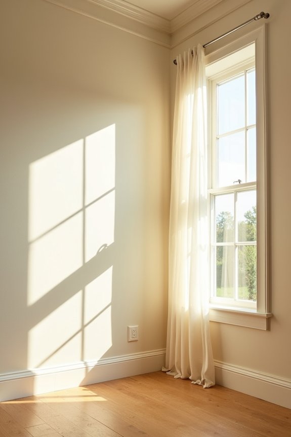
How do you create visual cohesion in a room without sacrificing definition between surfaces? Pairing warm white trim with white walls establishes a unified aesthetic. When selecting trim colors, choose warm whites like White Dove (OC-17) and Cotton Balls (OC-122) because they maintain soft undertones matching warmer wall bases. Simply White offers brightness while preserving warmth in complementary palettes. The key is aligning trim undertones with wall undertones to prevent stark contrasts, especially in spaces with variable natural light. Satin or semi-gloss finishes for warm white trim enhance subtle warmth without introducing glare. This wall trim pairing strategy creates spaces that feel cohesive and deliberately designed.
Cool White Trim: Architectural Detail That Stands Alone
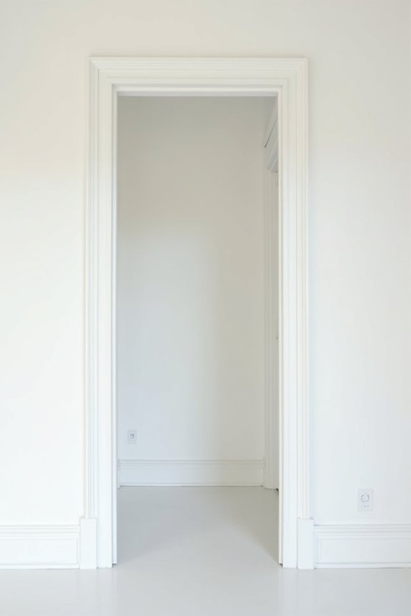
When you’re ready to emphasize architectural features rather than blend them smoothly, cool white trim delivers the contrast you’re after. Consider these key elements:
- Cool undertone pairs effectively with blue, gray, or cool-toned walls for cohesive, crisp aesthetics
- Semi-gloss or satin finishes highlight trim edges and catch light, making architectural molding stand out visually
- North-facing spaces benefit from cool white trim, which reads slightly grayer and enhances depth perception around details
- Testing multiple spots under varying lighting conditions reveals how cool white trim performs throughout your day
- Bold contrast emerges between cool white trim and warm wall tones without clashing
This trim color pairing strategy works when you want architectural detail to command attention. The finish selection matters significantly. Semi-gloss creates sharper definition than satin. Your lighting conditions ultimately determine how the cool undertone reads across your walls.
Saturated Colors: Making Colored Trim the Design Star
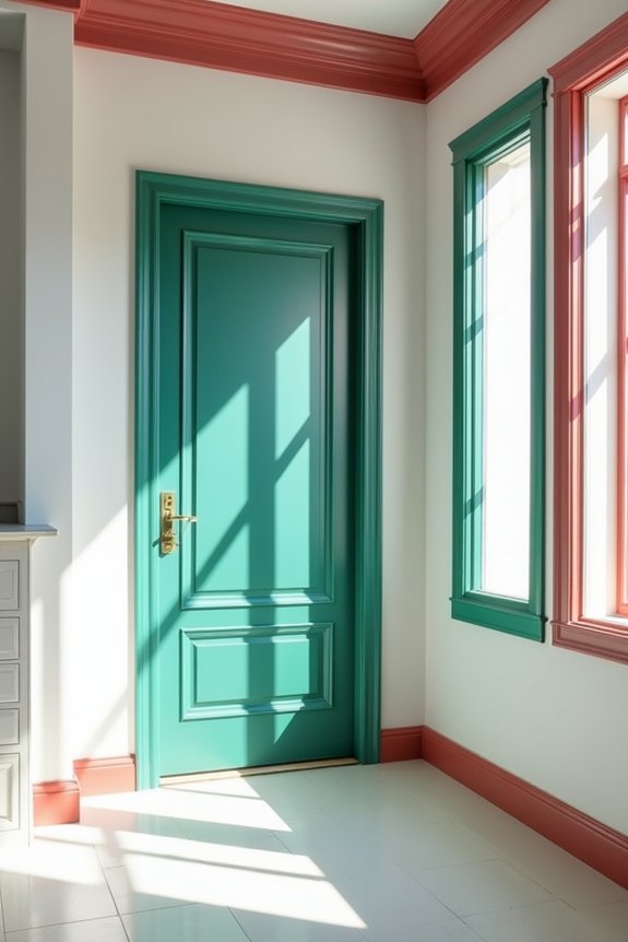
If you’re ready to shift trim from architectural support player to design focal point, saturated colors deliver the impact you need. Bold trim in deep hues—black, navy, or jewel tones—creates high-contrast trim against white walls that immediately draws attention to decorative features and architectural details.
I recommend pairing saturated trim colors with neutral wall tones to maintain balance while allowing your trim to dominate the design scheme. Varying trim sheen matters significantly; semi-gloss or satin finishes enhance depth and highlight edges without diminishing color intensity.
Testing saturated trim under different lighting conditions is necessary. Colors shift dramatically between natural daylight and artificial light, affecting how your color pairing reads throughout the day. This process allows your design to perform consistently across all conditions.