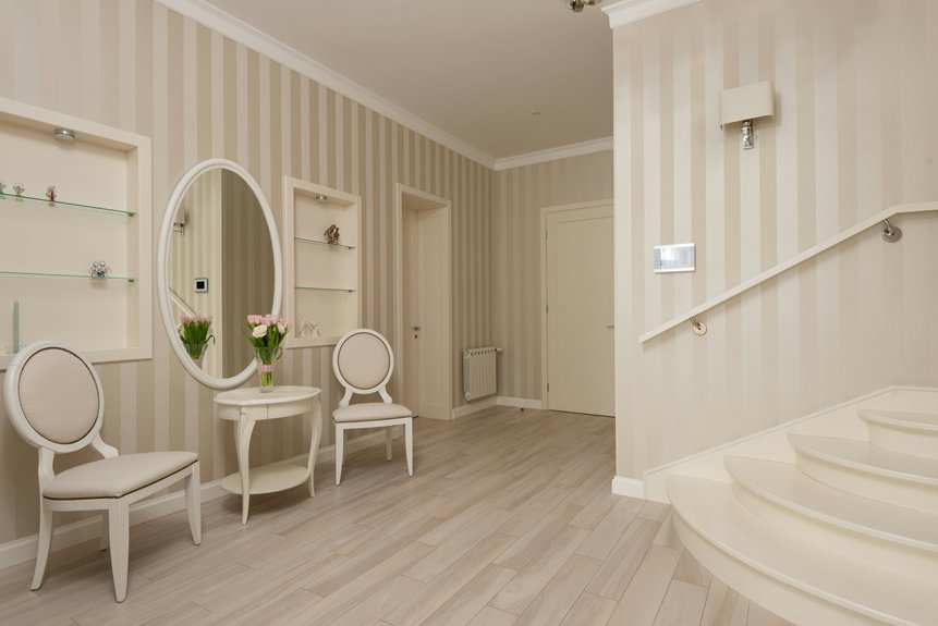
I’ve identified seven drape colors that work effectively with beige walls: cream, ivory, and oatmeal create seamless harmony; taupe and greige add subtle depth through warm undertones; soft gray provides contemporary contrast; emerald and burgundy deliver visual impact as jewel tones; gold and bronze metallics introduce warmth and light reflection; patterned fabrics tie beige and brown together using the 60-30-10 rule; testing swatches under actual lighting conditions allows your chosen color to perform correctly across morning, midday, and evening conditions.
Understanding how each color interacts with your specific space requires examining them directly against your walls.
Neutral Tones: Cream, Ivory, Oatmeal
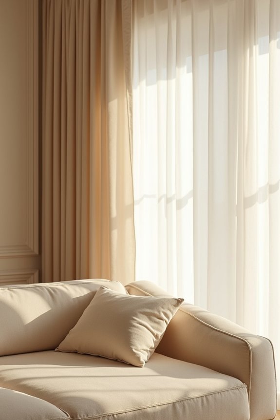
When you’re selecting drapes for beige walls, consider the understated elegance of neutral tones. Cream, ivory, and oatmeal curtain colors create wall-color harmony that supports a cohesive appearance throughout your space. Cream curtains maintain a serene look, sitting visually close to beige walls without competing for attention. Ivory light curtains keep rooms bright while coordinating with warm beige tones. Oatmeal drapes blend with beige walls and brown furniture, establishing soft coordination across your palette.
These neutral tones offer practical advantages beyond aesthetics. They help curtains recede into the wall surface, making rooms feel slightly larger. These curtain colors support versatile future decor changes without requiring replacement. Selecting cream, ivory, or oatmeal provides lasting wall-color harmony and design flexibility.
Warm Taupe and Greige for Subtle Depth
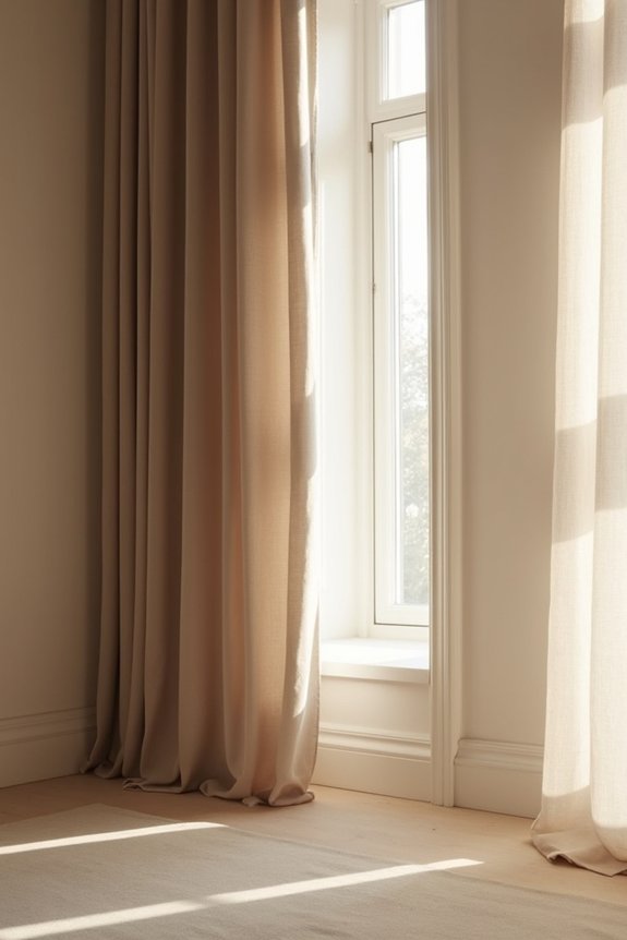
How do you introduce visual richness without disrupting the calm foundation that beige walls establish? Taupe and greige curtains work well for this purpose. These warm neutral tones blend seamlessly with beige walls while adding subtle depth through their gray-beige composition.
| Color Option | Visual Effect | Best Pairing |
|---|---|---|
| Taupe | Anchors brown furniture naturally | Warm ivory accents |
| Greige | Adds gray undertones for depth | Flax accents |
| Warm taupe | Reinforces cohesive scheme | Soft textured linen |
Incorporating linen texture in taupe or greige adds dimension against your walls without introducing strong color. The fabric’s natural weave creates visual interest while maintaining neutrality. Pairing these curtains with warm ivory or flax accents provides balance throughout your space. This approach supports versatile future decor changes while keeping your room grounded and deliberate.
Soft Gray That Complements Beige Walls
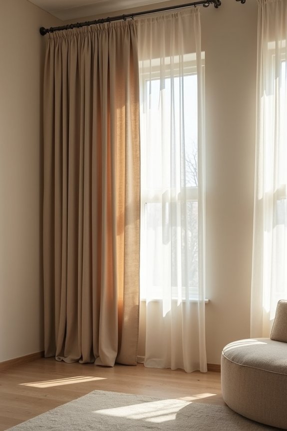
I’ve found that soft gray curtains create subtle contrast against beige walls while maintaining a calm, contemporary aesthetic that adds sophistication. Gray functions as a neutral base supporting both warm and cool undertones, allowing you to layer varied textures—throws, cushions, patterned accents—without visual conflict. Light gray fabrics with matte finishes preserve the airy quality of beige spaces, and testing swatches across morning, noon, and evening light guarantees shadows and highlights harmonize with your existing furniture and wall tone.
Gray’s Subtle Contrast Appeal
Soft gray curtains create a balanced counterpoint to beige walls, introducing enough visual distinction without disrupting the room’s calm atmosphere. Gray acts as a gentle neutral, working specifically with beige’s yellow and orange undertones to prevent spaces from feeling too warm or flat.
| Undertone Type | Best Gray Shade | Visual Result |
|---|---|---|
| Warm beige | Muted charcoal | Balanced, grounded |
| Neutral beige | Greige | Seamless, cohesive |
| Cool beige | Soft gray | Enhanced contrast |
The key lies in selecting muted charcoal or greige shades rather than stark options. Pairing these curtains with varied textures—linen, velvet, or satin—adds depth without overwhelming your walls. Coordinate with natural wood tones and cooler accessories to maintain harmony throughout your space.
Modern Aesthetic and Sophistication
Why settle for walls that feel disconnected from your window treatments?
Gray curtains establish a modern aesthetic that complements your beige walls through deliberate design choices. Soft gray drapes create sophistication by functioning as a visual anchor without competing for attention. The neutral tones work together, establishing cohesion across your space.
Consider these design elements:
- Gray curtains with texture prevent flat, lifeless appearances against beige surfaces
- Light control mechanisms maintain functionality while preserving aesthetic appeal
- Varied fabric weights improve space perception and visual depth
- Matte finishes enhance contemporary styling through subtle light absorption
- Neutral color palettes create harmony through timeless, adaptable design
Gray complements beige through strategic color placement. Your curtains with texture absorb light differently, adding dimension. This approach supports modern aesthetic principles while maintaining sophisticated restraint. The result: a cohesive environment reflecting deliberate design rather than random selection.
Texture Interplay With Neutrals
While gray curtains establish visual cohesion with beige walls, the real design opportunity emerges through deliberate texture combinations. Layering materials—linen, velvet, and suede—creates the depth that neutrals require. Soft gray curtains in silk or velvet provide tactile contrast against matte beige walls, preventing flatness. Pairing rippled or pleated fabrics adds dimension that solid colors cannot achieve alone. Light gray textiles work seamlessly with neutral sofas and cushions, enabling you to coordinate throws and rugs without visual competition. Texture becomes your focal point when you embrace this monochromatic approach. The varied surfaces catch light differently, establishing visual interest through material quality rather than color variation. This strategy results in a sophisticated, cohesive space with observable depth.
Jewel Tones: Emerald and Burgundy
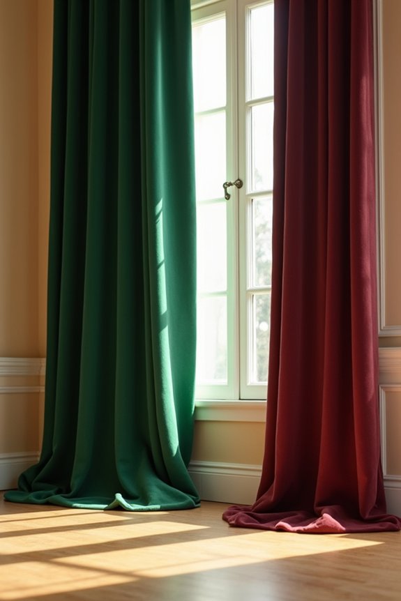
If you’re seeking to establish genuine visual impact, jewel tones like emerald and burgundy deliver rich color depth against beige walls. These saturated hues create sophisticated contrast, building a dynamic focal point without overwhelming your existing decor. You’ll achieve cohesive harmony by pairing jewel-toned curtains with coordinating accessories in warm or neutral shades, balancing boldness with restraint.
Rich Color Depth Strategy
How do you introduce bold color without overwhelming a neutral foundation? I’ve found that emerald curtains and burgundy fabrics create substantial color depth while maintaining balance against beige walls. The strategy involves layering jewel tones strategically so they function as primary accents rather than competing elements.
Here’s how I build this complementary color approach:
- Select emerald or burgundy curtains as your dominant visual element, allowing them to establish hierarchy
- Pair textured fabrics like linen or velvet with jewel tones to add tactile dimension
- Use a neutral base of brown furniture to ground the color scheme without diluting impact
- Incorporate taupe cushions and throws with metallic accents that echo your chosen jewel tone
- Keep surrounding walls soft beige or cream to maximize contrast balance
This contrast balance approach allows your jewel tones to command attention while your neutral base prevents visual chaos.
Sophisticated Contrast With Beige
Building on that foundation of strategic color layering, emerald and burgundy jewel tones deliver compelling contrast against beige walls when you position them as primary accents rather than secondary details. Emerald curtains create richness with natural inspiration, while burgundy curtains introduce warm, autumnal character. These deep hues anchor your space without overwhelming it. Pair your jewel tones with brown furniture and neutral pillows to maintain visual balance. Metallic accents—specifically gold or brass—add sophistication while soft ivory and taupe textiles ground the palette. Keep your remaining elements neutral. Use accent cushions, throws, and accessories to reinforce your chosen jewel tone. This approach allows your beige walls to serve as a backdrop for coordinated design rather than a limitation on your aesthetic vision.
Creating Visual Interest Boldly
Why settle for understated color when you can anchor your beige room with jewel tones that command attention?
Emerald curtains and burgundy curtains deliver striking visual interest against neutral backdrops. I’ve found that velvet curtains in these rich jewel tones convey luxury immediately. The warm undertones in beige walls align naturally with these hues, preventing visual clash. Rich textiles in emerald or burgundy create visual anchors that draw the eye directly.
Consider these approaches to maximize impact:
- Layer emerald curtains with coordinating cushions featuring solid jewel tones
- Select burgundy curtains in heavy velvet fabric for texture
- Combine drapes with throws incorporating similar rich hues
- Maintain balance using softer neutrals in secondary textiles
- Incorporate warm metallics that echo beige wall undertones
This strategy creates a cohesive, deliberate environment where jewel tones enhance rather than overwhelm.
Gold and Bronze Metallics for Warmth
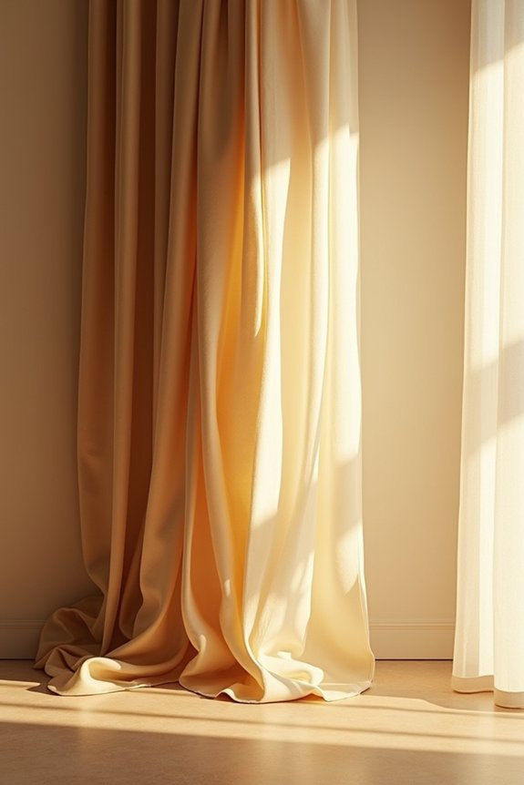
When you’re working with beige walls and brown furniture, gold and bronze curtains deliver both elegance and functional warmth to your space. These metallic draperies reflect natural light effectively, brightening rooms while enhancing luminosity throughout your home. I recommend pairing gold or bronze with neutrals like ivory, taupe, or oatmeal for a cohesive, rich aesthetic.
Select light-reflecting fabrics such as silk or velvet to achieve a luxe effect without overwhelming your décor. Matte textures balance the metallic sheen, preventing excessive shine. Bronze curtains work particularly well with warmer beige tones, while gold coordinates beautifully with lighter neutral palettes.
This approach reinforces visual harmony across your walls and existing furniture. Your metallic draperies become functional design elements that add depth and sophistication to beige interiors while maintaining understated elegance.
Patterns That Tie Beige and Brown Together
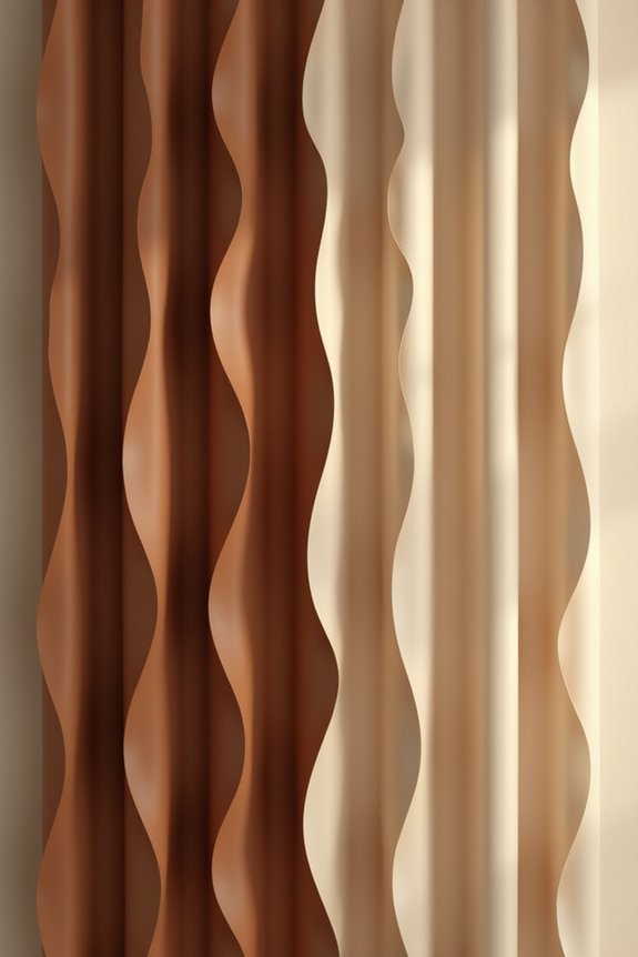
How do you introduce visual interest without disrupting the calm foundation of beige walls and brown furniture?
Patterned curtains bridge your neutral base with coordinated designs that repeat beige and brown tones. I recommend applying the 60-30-10 rule: your patterned curtains occupy the 30% accent position against dominant beige walls and brown upholstery. This distribution maintains balance while preventing visual chaos.
Quality textures amplify coordinated styling:
- Linen patterns create tactile softness and subtle movement
- Velvet designs add depth through light-reflecting surfaces
- Jacquard weaves introduce sophisticated texture variation
- Varying pattern scale prevents monotonous repetition
- Subtle stripes or motifs echo your existing palette
Select patterned curtains incorporating your chosen accent color throughout the design. This approach positions the pattern as a purposeful visual element rather than an isolated detail, strengthening your room’s overall aesthetic cohesion.
See Your Colors in Real Light Before Buying
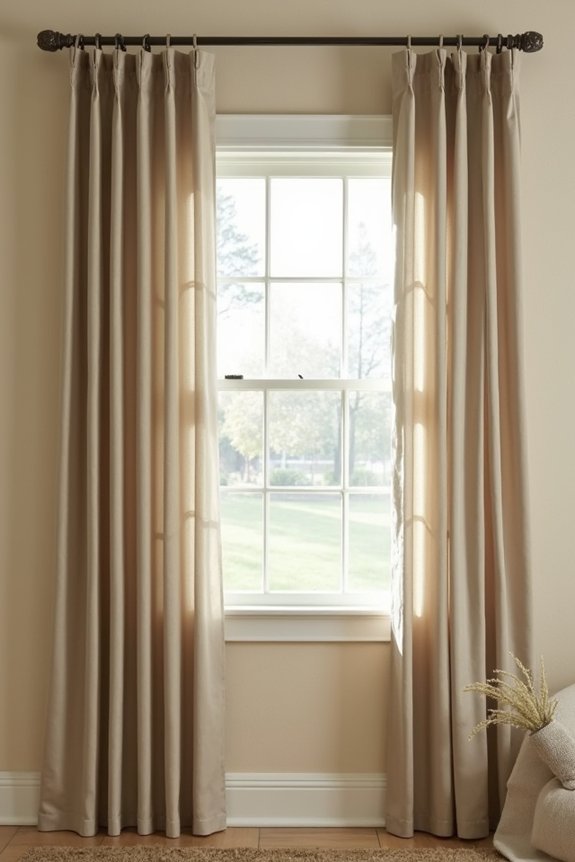
The color you see on a curtain swatch in the store won’t match what you’ll observe hanging beside your beige walls at home. I recommend ordering swatches and testing them under your actual lighting conditions—morning, midday, and evening lamplight reveal how undertone harmony shifts throughout the day. Position swatches against your beige walls alongside your sofa, rug, flooring, and hardware to conduct a genuine room test. This real light evaluation prevents costly mismatches by confirming whether your curtain colors possess warm or cool undertones that complement existing elements. Your fabric choices depend entirely on these results. Before customizing or purchasing full panels, document which swatches perform best under your specific lighting. This practical workflow helps your curtains integrate harmoniously into your space rather than clash unexpectedly.